Tuesday, March 8, 2011

Map 10- Crime Statistics


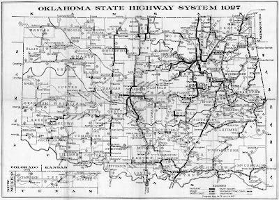
The problem with this map is that it is small, though I only found it on the internet. The title too long and it is not concise. Also, there are no labels indicated in the map. I'm not sure if it is an interactive map, but it will sure be more helpful for a map reader. The colors in the map are used to represent the number of crimes in different parts of the world.

Map 9- Physical Map of the Holy Land


The title of the map makes it clear that it is about the Holy Land. The map maker used colors that represents well the land and the body of water. Gradations in color was also used to show the differences in elevation. The texts are also easy to read. For the label of the body of water, the font was italicized, and the some facts are written and given emphasis through the use of a different-colored font. A scale was also indicated.

Sunday, March 6, 2011

Map 8- The Gulf Of Mexico Mess


The map looks messy when I first saw it, because of the combination of the symbols used in it. The lines and dots overlap, that it covers some of the dots and lines. The map also gave emphasis on the gulf by making its color more bright and attractive to the eye. Inset on the lower part of the map, together with the title is also helpful to know which part of Mexico was highlighted in the map. The elements in the map are well distributed so empty spaces were avoided.

Map 7- North Dakota Wind Resource Map


 The colors used in the map are vibrant/ loud, so it really catches attention.The labels are easy to read and there's not a lot of symbols used. It's only confusing that there are two scales indicated in the map.

Map 6


The map has no title, so basically, I don't know what it is about the first time that I saw it. The color is pleasing to the eye, since the map maker used an earth-toned color and its gradations, wherein the important information are given emphasis due to its darker color. The space across the map was also put into good use because all the elements are evenly distributed, so empty spaces were avoided. Labels are readable, and the legend can be understand easily. Lastly, sources are properly cited.

Map 5- Dialects in North America


At first glance, we can say that the map has a lot of information in it, though it looks pleasing to the eye because of the combination of colors used. Some labels are too small to read and the information are scattered all over the map. There are also a lot of combination of symbols in the map which can be confusing for the map readers. Lastly, I also noticed that there is no title and sources indicated.

Map 4- Oklahoma State Highway System 1927


The map is also in black and white. I noticed that the map is hard to understand because there are a lot of things happening in it. The information are crowded and some labels are small to read. Good thing that a the legend is indicated.

Map 3- Hot spots in Salt Lake City


The map looks pleasing to the eye, though the the only colors used were black and white.All the necessary elements of a map, like the legend, inset and orientation, were also indicated.The contents of the map is not too crowded, but it shows all the necessary information that the map reader needs.